
Best Customer Feedback Dashboards for Action
October 10, 2026
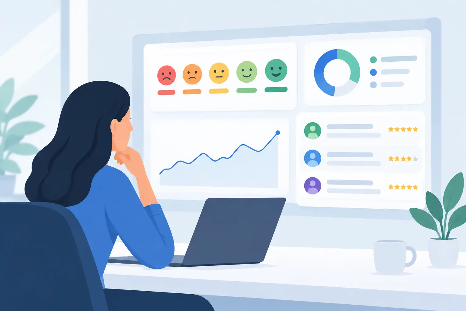
A dashboard can report that customer satisfaction fell three points. It cannot, by itself, explain whether the problem is late delivery, confusing invoices, an unresolved service issue, or a policy customers consider unfair. The best customer feedback dashboards close that gap by bringing scores, comments, complaints, emails, and operational records into a view that helps teams decide what to fix next.
For customer-experience and operations leaders, the question is not simply which dashboard looks best in a leadership meeting. It is whether the system can organize feedback from the systems already in use, identify recurring drivers, route accountable work, and show whether corrective action improved the experience.
What Makes a Customer Feedback Dashboard Useful
A useful feedback dashboard starts with a clear operating question. A service leader may need to know why contacts are rising after a new process launch. A CX team may need to separate product-quality complaints from communication failures. An executive may need a reliable view of risks affecting retention across regions, account segments, or service channels.
That means the dashboard should combine quantitative and qualitative evidence. Scores such as NPS, CSAT, CES, response rate, complaint volume, and resolution time provide directional signals. The written explanation behind those signals provides the operational context. If a dashboard only charts survey averages, it can show that something changed without showing the root cause.
The best systems also preserve the link to the underlying feedback. A manager reviewing an increase in billing complaints should be able to inspect the relevant comments, emails, or case notes, understand the classification logic, and determine whether the pattern is widespread or driven by a small number of high-impact accounts. This is essential for trust. Teams act faster when they can see the evidence, not just a category total.
The Core Views the Best Customer Feedback Dashboards Need
There is no single perfect dashboard for every organization. A contact center, field-service operation, healthcare provider, and B2B software company will prioritize different metrics. Still, the strongest feedback programs generally need a connected set of views rather than one crowded executive screen.
Executive health view
This view answers whether the customer experience is improving, declining, or becoming more volatile. It should show trend lines for key experience measures, feedback volume, major issue themes, and material changes by customer segment, product, location, or channel. Keep it focused. Executives need a decision view, not every available cut of data.
A useful executive view also distinguishes a meaningful change from normal variation. A one-week decline in satisfaction may not justify a major intervention if response volume is low. A sustained decline paired with a rising volume of similar complaints deserves attention.
Theme and root-cause view
This is where qualitative feedback becomes operational intelligence. It should organize open-text responses and other unstructured records into consistent themes, subthemes, sentiment, severity, and drivers. For example, “poor communication” is often too broad to act on. A usable classification may separate missed status updates, unclear next steps, delayed callbacks, and contradictory information.
Classification needs governance. If each analyst creates their own labels, trend reporting quickly becomes unreliable. A shared root-cause library gives teams a controlled language for tracking issues over time while allowing new themes to emerge when the feedback warrants it.
Segment and journey view
Customer averages can hide a concentrated problem. A dashboard should make it easy to compare experiences by account type, geography, product line, tenure, service team, journey stage, and other relevant attributes. This helps teams identify where a problem begins and who is affected.
For example, new customers may report difficulty during onboarding while long-term customers are satisfied. Treating that as one company-wide score masks the intervention needed: improve setup guidance and early support, not the entire service model.
Case, complaint, and recovery view
Feedback programs often fail at the handoff from insight to response. A complaint dashboard should show case volume, severity, aging, ownership, response status, and recurring categories. Where possible, it should connect individual records to the broader themes found in survey comments and inbound emails.
This matters because a complaint is both an individual recovery obligation and a source of pattern detection. Closing the ticket without examining its cause may resolve one customer’s problem while leaving the underlying process untouched.
Action and accountability view
The most overlooked dashboard is the one that tracks what happened after the insight. A proper action view documents the issue, the supporting evidence, the owner, planned intervention, due date, status, and expected outcome. It should also let teams return to the relevant measures after implementation.
Without this layer, feedback dashboards become reporting artifacts. Teams can repeatedly identify the same issue, yet no one can see whether a fix was approved, tested, completed, or effective.
How to Evaluate Feedback Dashboard Platforms
When comparing platforms, begin with your feedback environment, not a feature checklist. An organization collecting only transactional surveys may need a capable survey analytics tool. An organization receiving surveys, complaints, emails, work-order notes, support records, and stakeholder feedback needs a broader Feedback Intelligence Platform.
First, assess data-source coverage. Ask whether the platform can ingest the formats and systems your teams already rely on. Requiring people to copy and paste comments into a new repository creates a reporting gap and undermines adoption. The value of a dashboard increases when it reflects the full body of customer evidence, not just the data collected through one tool.
Next, evaluate text analysis with care. Automated sentiment and topic detection can accelerate triage, but generic labels are not enough. The platform should support business-specific classifications, transparent review, and the ability to refine categories as products, policies, and customer language change. Automation should reduce manual effort, not create a black box that nobody trusts.
Then look at workflow. Can a team assign a recurring issue to an accountable owner? Can that owner document progress? Can leaders review overdue actions alongside the feedback that prompted them? These questions separate a dashboard built for observation from one built for operational improvement.
Permissions and sharing also matter. A frontline manager may need to see site-level feedback and assigned actions, while an executive needs cross-business trends. A research team may need access to response-level detail without exposing sensitive fields to every viewer. Flexible roles and shareable insight views make the same system useful across audiences without losing control.
Finally, test the path from question to answer. Ask a real question from the last quarter, such as: “Why did satisfaction decline among enterprise customers after implementation?” Then see how many steps it takes to locate the relevant records, examine the comments, identify likely causes, and document a response. A polished chart is less valuable than a short, repeatable path to a defensible decision.
Avoid the Common Dashboard Failure Modes
The first failure mode is metric overload. When a screen contains twenty KPIs, trend charts, filters, and heat maps, users often leave without a decision. Organize views around specific management questions and provide drill-down paths for people who need detail.
The second is survey-only reporting. Surveys are valuable, but they capture only one portion of the customer voice. Customers also explain problems through support emails, complaint records, work notes, account reviews, and unsolicited messages. Excluding those sources can produce an overly optimistic or incomplete picture.
The third is treating sentiment as a diagnosis. Negative sentiment tells you that frustration exists. It does not reliably tell you whether the source is pricing, reliability, staff behavior, policy, or an unmet expectation. Teams need structured themes and direct evidence before acting.
The final failure mode is no action mechanism. Reporting a recurring issue month after month can create dashboard fatigue. Build an Action Backlog that makes ownership visible and requires teams to connect interventions with measurable outcomes.
Building a Dashboard That Drives Decisions
Start with two or three decisions the dashboard must support. Examples include prioritizing service improvements, reducing repeat complaints, identifying at-risk accounts, or validating the impact of a process change. Define the measures, feedback sources, segments, and review cadence for each decision before designing the visuals.
Then establish a consistent classification structure. Include enough detail to distinguish actionable causes, but not so much that analysts spend more time debating labels than learning from feedback. Review the taxonomy regularly, especially after launches, policy changes, or shifts in customer behavior.
Set an operating rhythm around the dashboard. Weekly reviews may focus on emerging risks and aging complaints. Monthly reviews may assess theme trends, owner progress, and completed actions. Quarterly reviews may evaluate whether improvements changed customer outcomes. The right cadence depends on feedback volume and operational speed, but the routine should be explicit.
StatQuestions supports this connected model by centralizing existing feedback data, organizing unstructured content through Guided Analysis, and linking insights to accountable work in an Action Backlog. The goal is not to create another place to view charts. It is to give teams a controlled path from incoming feedback to root-cause evidence, decisions, and follow-through.
The most valuable dashboard is the one that changes the next conversation. When a leader can move from “satisfaction is down” to “these customers are affected, this is the recurring cause, this owner is addressing it, and this is how we will measure the result,” feedback becomes part of how the organization runs.